Get Your Reps
product, design, and engineering lessons from building Sail & Muddy
In 2022 I was looking for a very specific thing: a small team, less than ten people, before product market fit, working on something I actually cared about. I started coding early on and have always loved building and computers. I was interested in startups and in the future of personal computing. Two friends from college, Ron and Jimmy, reached out. They'd been working on this idea of a new browser, forked Chromium, figured out how to build on top of it, and raised a 5.5 million dollar seed from General Catalyst, Naval, Lachy Groom, YC, and others. By the time I joined as a founding engineer one of the hard parts was done. You could build on top of Chromium, access tabs, the history API, and all the UI could be built with web technologies. But the other hard part was still ahead of us: what to build, how it should work, and whether anyone wanted it.
I've always loved the philosophy of the open web, and I'm deeply grateful for it. I love frontend engineering and I'm very product minded. Getting to build on top of Chromium, millions of dollars in R&D forked from earlier browser engines × Chromium was forked from WebKit, which was forked from KHTML. One of my favorite things about the codebase: the C++ source files have stacks of copyright notices from different organizations dating back to the 90s, everyone adding their own signature on top of older and older code. Standing on the shoulders of giants. , felt both humbling and like an experience that would really stretch me. We were aiming to build a window worthy of the work you do and the work you do with other people. That evolved into collaborative software: realtime multiplayer, infinite canvases, rich text editors, chat, all packaged into the browser alongside web content. Framed as a "multiplayer browser" or "team browser," it was an attempt to channel venture dollars into a new kind of personal computing company. Sail, and later Muddy, were the products that came out of that vision.
Lots of people want to build new computing paradigms, new interface ideas. We gave it a real shot. Past flashy demos and hypotheticals. We studied both the history of personal computing and your favorite productivity software (Slack, Notion, Linear, you name it), talked to users, built new interfaces, shipped them, and watched most of them not work. Building and maintaining a browser product was unusually hard, and even though it did not work out as a company, the team proved a lot and learned a lot. Building a startup forces you to see past the grand vision. We failed to make something that a lot of people wanted and could grow. But I came out of it a fundamentally better product thinker, engineer, designer, builder, and hacker than when I went in. I got my reps in. Here's what I took away.
What We Built
When I joined, Sail was a very much in progress infinite canvas app built on top of our own Chromium fork × I learned a lot about browsers working on this. Chromium University is a great resource. A lot of the talks that Chromium developers share with each other are available online freely and are pretty fun to watch. . You could put websites in, add some text cards, see people's cursors, but it was still taking shape. Positioning wasn't locked in yet, and there were features to build out and bugs to fix. We iterated on it and drew inspiration from Muse × Adam Wiggins wrote an excellent retrospective on Muse. Worth reading in full if you're building in this space. , Kinopio, and a lot of other infinite canvas apps I can't even remember all of, riding the energy of the canvas moment when Miro and FigJam were surging. A fun positioning we talked about at some point was "Spatial Notion." Sail was the most fun version and what got me to join. Using it felt magical. Browsing the web and feeling like it's the web, not a streamed video feed like you would in a Zoom screenshare, seeing other people's cursors and imagining how everyone could actually be doing work in the same canvas side by side, having these random encounters like you often do in Figma when you browse the same design file. It felt super cool. But cool demos, cool visions, and cool feelings aren't always enough. Though of course, sometimes they can be.
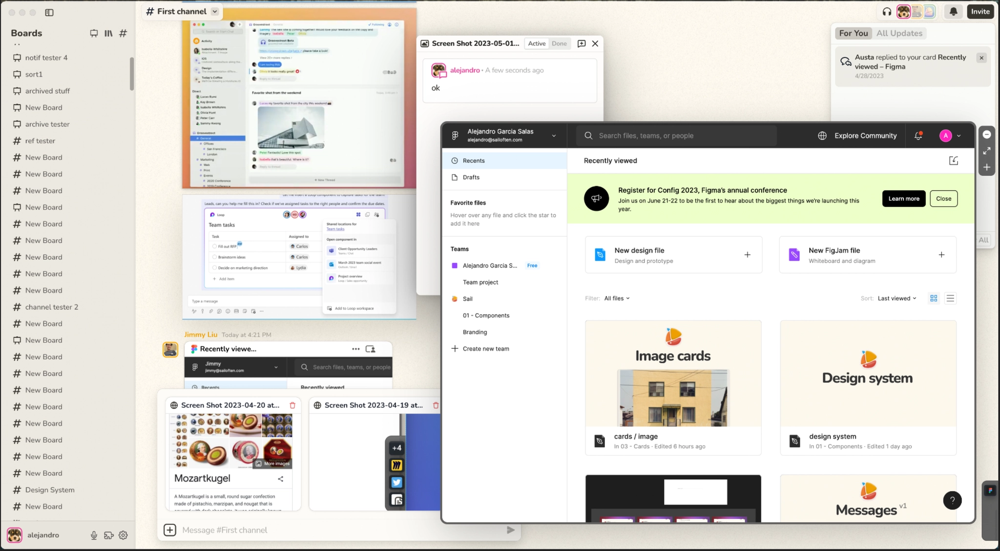
Sail: "FigJam or Miro with a browser built in, you could place live websites on an infinite canvas and everything was multiplayer."
Sail never got a broad public launch. We tested it with different types of users looking to make themselves more productive, but there's a chance we failed to reach a specific type of user that would have loved Sail. I really wish we had launched more widely × Paul Graham nails this: "The danger of working in secret is inversely proportional to the simplicity and precision of the test. It would be safe to work in secret for a year on a new rocket engine. But if you work in secret for a year on a new social network, it will probably be a flop." . No one cares about your launch. Taking too long to launch builds up pressure. You start protecting a reputation you haven't earned yet. And if you take too long, you give yourself fewer chances to relaunch. Brian Chesky × "If you launch and no one notices, you can actually just keep launching." Airbnb launched three times before it got traction. said it best: if you launch and no one notices, you can just launch again.
After Sail we went through what we internally nicknamed the "multiverse project," a version that supported different kinds of boards: infinite canvas, structured canvas (Nototo-style), and chat. Because it was all built on the same sync engine, trying different form factors was relatively easy. We even got to the point where you could reference usable instances of one board type inside another. It was cool. It also got really complex. Chat is what survived, and it became the foundation of Muddy.
The "multiverse project": chat, canvas, embedded websites, and multiple board types all at once. It got complex.
Muddy: "Slack and a browser as an integrated work environment."
Chat is lindy × The Lindy effect: the longer something has survived, the longer it's likely to keep surviving. Chat as an interface has been around since IRC in the 80s. It's not going anywhere. . People understand it immediately, it's legible, it caters to a lower common denominator more easily than a canvas, and it transfers to mobile. We had a React Native app on TestFlight, built with help from contractors. The scope and table stakes for productivity software keep going up, people expect a mobile companion app.
But we overindexed on table stakes. In hindsight, we should have tackled the harder problems around positioning head on rather than working on the mobile app. The positioning got us too close to Slack, and you risk just being another chat app. Muddy's embedded tabs in chat were genuinely good. I believe we innovated in that UX and I'd love to see something like it in apps like Slack. But forward-looking UX doesn't always win. The final UI of most apps has inefficiencies, things that aren't really optimal, and people are fine with that. A better interface isn't enough reason to switch if the current one is good enough. A lot of people have tried to beat Slack (more on this soon).
Positioning
Part of the company's thesis was shaped by Kevin Kwok's The Arc of Collaboration, the idea that collaboration should be native to productivity apps, not a separate layer, and that there's room for a metalayer across all of them. It's a thought-provoking read. Kwok argues that Slack is "911 for when everything falls apart," not air traffic control, and that the real opportunity is a layer that sits across all your apps handling presence, collaboration, and identity. That's essentially what we were trying to build with the browser. It made a lot of sense on paper. I see it differently now, but at the time it was a strong inspiration.
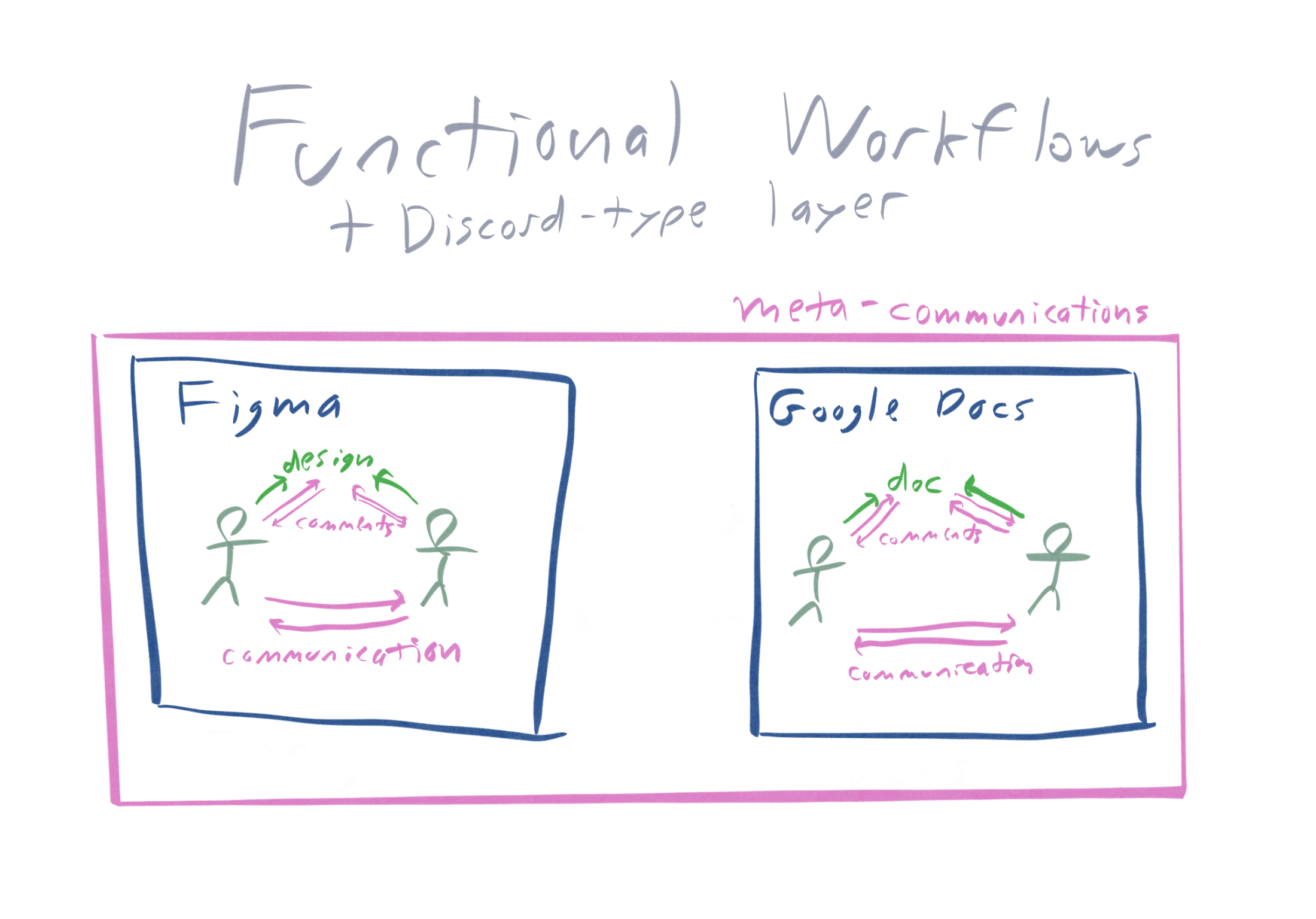
From Kwok's Arc of Collaboration: functional workflows (Figma, Google Docs, etc.) each with collaboration built in, and a Discord-type metacommunications layer sitting across all of them. We had some version of this diagram internally, with the browser as that metalayer.
Charts like this can be compelling, and this one was. The key is to know how to look beyond it and keep poking holes, experimenting, testing against reality. More on this in Reps, Theses, and Proof of Work.
The browser category is treacherous. There are at least two ways to think about a browser: as a metalayer for communication, or as a glorified HTML renderer. Both are true at the same time, which is part of what makes it so hard to position. Today when I describe the products I usually start with "multiplayer browser" and then get specific. "FigJam or Miro with a browser built in" for Sail, "Slack and a browser as an integrated work environment" for Muddy. Those descriptions are what I gravitated to because they land. But the descriptions that land aren't necessarily the descriptions that lead people to the right behavior. Would people think to use this as a meta layer for work? Or are they just stuck on "oh this is like Miro but with websites, I'll use it for all the things I use Miro for." Or with Muddy, "oh this is a better Slack" (though of course no one wants to position themselves as "better version of X" especially when they are not that much better). We went back and forth on whether we should position ourselves as a browser at all. "A browser that is not a browser." Can we really get away with positioning this as an operating system? That term is so saturated and overloaded and technical. An "all in one workspace," too broad and complicated. How do you explain that you have embedded web contents and that all auth, extensions, and everything else work like a browser, when the UI doesn't always land like that?
We weren't alone in this struggle. While we were building Sail, Arc by Browser Company and Mighty were in development too. All of us talked about building a new kind of computer. That framing is great for recruiting and to some extent high level marketing. But there's a gap between what you want people to do, what you want people to say, what people actually say, and what the thing actually is. No matter how ambitious the vision, the market reduces you to a simple description. Mighty × Mighty shut down in 2022. Their retrospective is honest about why: "the benefits of Mighty just weren't substantial enough to handle the drawbacks." Apple's M1 chip ended up matching their cloud server performance, eliminating much of the speed advantage. becomes "fast Chrome on the cloud." Arc × Browser Company pivoted away from Arc to build Dia, an AI browser. Josh Miller's letter to Arc members describes it well: "for most people, Arc was simply too different, with too many new things to learn, for too little reward." Only 5.5% of daily users used more than one Space. They called this the "novelty tax." becomes "pretty browser with a more organized sidebar." Sail becomes "Miro but with websites."
Every product in this space was cool, genuinely cool, the same way Muse was cool. But being cool isn't a business. Muse had tens of thousands of active users, thousands of customers, and still couldn't make it work × Adam Wiggins in his Muse retrospective: "Muse got there for a few thousand people, but the economics of prosumer software means that just isn't enough. You need tens of thousands, hundreds of thousands, to make the cost of development sustainable." . Ultimately these simple positionings have to break through to a broader level of transcendence to justify venture scale. Ours didn't. That's part of the issue.
You can see the same pattern in other companies that have tried, or are still trying, to do "the future of personal computing," all launched while I was working at Sail and Muddy. Rabbit R1, pitched as an AI device, really an Android phone reskinned with AI. Humane AI Pin × Humane sold only 10,000 units against a 100,000 target. HP acquired the assets for $116M, a fraction of what Humane had sought. , pitched as a new computing paradigm, really an clip-on accessory with a camera and an AI assistant. The grand vision and the simple description are always in tension. I'd be cautious of any company whose branding is "here's the history of computing, and now here's us." Unless there's a legible use case underneath. Notion pulls this off. Aspirationally they are building a "tool for thought," and to some extent they are actually executing on that. But most people don't talk about Notion that way. They talk about it as a wiki, as a docs tool, as a project tracker. The aspirational vision lives underneath a use case that people already understand. That anchor is what most of these other companies, including us, didn't have.
We did a lot of platonic decomposition for Sail and Muddy. Find the smallest set of concepts × Ryo Lu (Head of Design at Cursor, previously founding designer at Notion) articulates this thinking well. "How few building blocks can you get away with?" In his Dialectic and a16z interviews he contrasts purpose driven design (start from a specific user problem) with system driven design (design flexible, universal concepts that compose). that compose into everything you need, design the system not the screens. In our case: web cards, text cards, comments, messages, threads, notifications. Groups and threads were the same concept (groups in the canvas, threads as a group of messages), and messages could exist in both canvas and chat spaces. It's easy to get nerdsniped here. Unraveling the primitives feels cool and feels like you're finding a truth of sorts. It worked well for building and there were some neat emerging capabilities, but that matters less if you still fail to communicate how people would compose these concepts into their own workflows. We even briefly talked about positioning it as "build your own workspace." Notion does this well: blocks, pages, databases. But people talk about Notion as a wiki, a docs tool, a project tracker. The system works because people can describe what it does for them in simple terms. We never got there. The reaction to our products was always "that's cool" followed by not adopting it. Elegant decomposition impresses builders and is useful for developers, but we weren't building a developer tool. Users just want to know what it does for them.
Two tests I think about now. The first is the landing page test. Force yourself to make a landing page for the product. Not a pitch deck, not an internal doc, a real page that has to sell the thing to a stranger. It forces you to articulate what this is, who it's for, and why they should care, in a way that internal discussions never do. When you're building you can hide behind complexity, behind "it's hard to explain," behind the system and the concepts. A landing page doesn't let you. Even if the product isn't ready yet, you don't need to actually build an expensive page, just have a mental idea of one and check back on it every so often. If you can't fill the page, you don't know what you're building yet and why people want it.
The second is what I call the Sandwich Video test. Sandwich × Adam Lisagor's Sandwich became the go-to production company for Silicon Valley startup launch videos. They made iconic spots for Slack, Square, Coin, Flipboard, and others. In 2023 they started taking equity instead of cash from younger startups. made the "So Yeah, We Tried Slack…" video. You watch it and you immediately understand what Slack is, who it's for, and why your team should switch. Think about what would go on your version of that video. What's the story? What scenes do you show? If you can't picture it, that's a signal. Part of why that video worked so well is that Slack was cool. There was this special window, maybe 2013 to 2016, where a lot of companies wanted to be like startups, they wanted to move fast, use the tools the cool kids were using. Slack rode that perfectly. The brand, the tone, the colors, the "we're not email" attitude. Being cool gave them a wedge that a feature comparison never could. Sandwich captured that energy for other startups too. Coin's launch video hit their $50,000 pre-order goal in 40 minutes × Coin eventually collected 350,000 pre-orders. Dropbox did something similar earlier, driving their beta waitlist from 5,000 to 75,000 signups overnight with a demo video before the product was fully ready. A great video can be worth more than a prototype. .
We chatted internally about both the landing page and the video. We looked up to the Sandwich video as really cool. But this all came too late. I wish we'd done both exercises much earlier × Back then I actually played with making a product video using gen AI tools, Runway for video, DALL-E for images, ElevenLabs for voices. The tech was too weak at the time, everything looked uncanny and choppy. But now with tools like Veo, you could probably make a pretty convincing meme-y parody of that Slack video. The gap is closing fast. .
The Graveyard and "The Best Polished Version"
And on top of all the positioning challenges, users kept rejecting multiplayer. This wasn't unique to us. Tandem × Tandem was a virtual office app. Rajiv Ayyangar wrote a detailed retrospective on what happened. (virtual office) raised $7.5M from a16z, went exponential during COVID, was multiplayer by default, and concluded that "most people don't feel a need to talk to their co-workers that often." Rajiv frames it as how you want the world to work vs. how it actually works: "I wish we all wanted to talk with our team frequently and collaborate closely. But, most people don't... They value the autonomy and convenience of remote work, even if it can lead to disconnection and loneliness." Multi got acquired by OpenAI. Screenhero × There's still a recording from 13 years ago on YouTube. got acquired by Slack in 2015 and eventually sunsetted. Even Google Wave × Pretty ahead of its time. The 2009 demo is worth watching. Its realtime collaboration technology (operational transformation) influenced Google's collaboration suite and was open sourced as Apache Wave. , which felt ahead of its time when we studied it, couldn't make realtime collaboration stick, all the way back in 2009. It tried to be email, instant messaging, and a document editor all at once. Too much surface area, no clear anchor. Microsoft Loop had the vibe of a multiplayer collaborative workspace but ended up being essentially Microsoft's clone of Notion. Safari × Apple announced Shared Tab Groups at WWDC 2022. You could share a set of tabs with others and see what they were browsing in real time. It was quietly deprioritized. had a multiplayer tab groups attempt. A lot of smart people have taken swings at this space. The pattern isn't that the ideas are bad. Multiplayer doesn't work well as a standalone product. Work is a lot more siloed than we want to believe.
In hindsight, there's also a world where we could have let go of the
browser, or ridden the AI browser wave. Pivoted into an "AI
workspace." We talked about having agents in the
workspace (we even joked about an AI agent called "MuddyBuddy"),
and you can imagine how our multiplayer infrastructure would have
transferred naturally to agentic use cases. While still working
at Muddy, I happened to be one of the first
Cursor × One of the first 10–20
users, back in January 2023, before they even forked VS Code. Back
then what made it special was that you could prompt rather than just
get ghost text autocomplete. Agentic capabilities weren't a thing yet.
 users, AI coding was just getting started, agentic
capabilities weren't a thing yet, and there was no AI browser wave
to ride. Companies like
Adept × Amazon eventually
hired
the founders away. were still figuring out computer use,
and it wasn't something we could have integrated in. We were too
early. Even now, a couple years later, computer use still has a ways
to go. I think deeper integrations like
WebMCP
will matter more than DOM level automation. Once you've started as
a browser company it's hard to pivot away from that.
users, AI coding was just getting started, agentic
capabilities weren't a thing yet, and there was no AI browser wave
to ride. Companies like
Adept × Amazon eventually
hired
the founders away. were still figuring out computer use,
and it wasn't something we could have integrated in. We were too
early. Even now, a couple years later, computer use still has a ways
to go. I think deeper integrations like
WebMCP
will matter more than DOM level automation. Once you've started as
a browser company it's hard to pivot away from that.
There's a strategy I think of as "the best polished version." You build the last version of the thing. The category is mature, the data models and use cases are clear, and people don't care about novelty anymore, they just want the best. Linear did it for Jira. Vercel did it for the frontend developer experience. It works, but only under specific conditions: the existing tool has to suck enough. Jira is terrible. Everyone knows it. The delta between Jira and Linear was large enough that people were ready to switch. Arc was shooting for this too, but for the browser. The problem is that Chrome is already good. Slack is already good, plus years of integrations, Slack Connect, and a thousand paper cuts that add up to real switching cost. Making a better version of something that's already good enough is hard. A lot of teams in this space start from the same place: communication is too noisy, too fragmented, too broken, and we can do it better. It's a compelling frame because it's partly true. But a lot of teams arrive at the same conclusion independently, and the hard part isn't the diagnosis, it's the proof. The graveyard of better Slacks is long: Campsite × Async-first team communication by Brian Lovin and Ryan Nystrom. Raised ~$5M from Lux Capital. Wound down in 2024. , Quill × Built by Ludwig Pettersson. Raised ~$7.5M from a16z. Had genuinely good features that improved on Slack's threading and notifications. Acqui-hired by Twitter in 2020 to work on DMs. , Threads × Thread-centric team communication. Raised ~$10.5M from Sequoia and a16z. More structured than Slack, every conversation was a discrete thread. Acquired by Shopify in 2021. Not to be confused with Meta's Threads. , and more you've never heard of. Browser Company tried a better Chrome. We were trying to replace both at once. The combined friction of Chrome plus Slack simply wasn't bad enough for anyone to endure the pain of switching to us.
Under the Hood: Technical Bets and Dogfooding
The multiplayer architecture was genuinely clever. Instead of streaming video, we streamed DOM mutations. When someone joined a shared tab, the system would snapshot and reconstruct the DOM. The sync engine underneath (GraphQL subscriptions over WebSockets, Recoil, Apollo) made pivoting between product forms surprisingly easy. Canvas to board to chat, the plumbing just worked.
HTML, CSS, and JS are absurdly powerful primitives. We built an infinite canvas, rich text editors with Prosemirror × Great piece of software by Marijn Haverbeke. If you've used a rich text editor on the web, there's a good chance it's built on Prosemirror. , realtime collaboration, all running inside a browser that was itself a product. Lots of fun edge cases, like scaling Prosemirror editors inside transformed canvas divs. Hard, satisfying work. And because all the UI was web UI, based on the open source browser Vivaldi × Vivaldi's UI is built with web technology (HTML, CSS, and JS) on top of Chromium. , we got a Windows build fairly fast. I remember thinking that was pretty neat. A different tradeoff than going native × Arc went with native UI in Swift, which meant figuring out how to get Swift working on Windows. .
But none of this was the bottleneck. The architecture was sound. The sync engine made pivoting trivial. We could prototype a new product direction in weeks. The bottleneck wasn't technical. The architecture gave us real leverage, but leverage doesn't help if you haven't figured out who needs it.
At one point we fully migrated off Discord onto our own product. We tracked tasks in Sail and Muddy instead of Linear, reduced Notion to a document editor for when we needed something more complex than our text editor. We ran the company on it. This felt like validation.
Beware dogfooding. It teaches you less about go to market than you think. If you clone Slack × Slack itself grew out of dogfooding, an internal tool built during the Glitch game. But when Butterfield opened a preview in August 2013, 8,000 people requested invites in two weeks and 93% of users who tried it never stopped. The dogfooding gave them a polished product, but the external signal came fast and loud. and dogfood it, you can test whether it's bug free, whether it feels good. You'll know the product is good, is ready, is there when you see it. But you're not testing whether anyone else wants it. We didn't clone anything, but the point stands. We understood every concept because we invented every concept. We could navigate the complexity because we had authored it. External users hit the same wall: "What am I supposed to do with this?" Too many concepts, too many kinds of spaces, too steep a learning curve. We were often solving interface problems when we should have been solving workflow problems. What actually matters is the workflow and the sensation you get when completing it. The dopamine hit when you send a message, the feeling of accomplishment when you check something off. The interface is just a conduit.
Early Early
People don't understand what really early looks like unless they've been there. When people say "early Notion," they usually mean after the relaunch, after the product clicked, after there was already some shape to the story. They usually do not mean the part where Ivan Zhao and Simon Last laid off their small team, sublet their San Francisco office, and moved to Kyoto to rebuild the product from scratch. Notion's real reset × In Figma's 2019 interview with Ivan Zhao, the company says the founders had to "fire their fledgling team of 4 and start over," then move to Kyoto to rebuild. Sequoia's profile describes Ivan coding 18 hours a day in a two-story house with shoji screen bedrooms. Sources: Figma interview, Sequoia profile. That's the part most people skip. That's the part that isn't legible from the outside. That's the part we were in. In one interview, Ivan mentions sneaking into Trick Dog in the Mission. We used to go to the same bar after work.
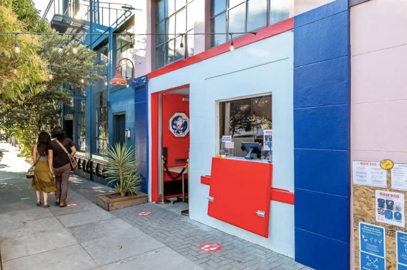
Trick Dog, next to Sightglass — my go-to coffee shop near our office. Photo via 7x7.
Figma is another example. Dylan Field × Field dropped out of Brown in 2012 on a Thiel Fellowship. Index Ventures led a ~$4M seed in 2013, then Greylock led a $14M Series A in 2015, both before any public product. Figma launched publicly in September 2016 and arguably didn't hit PMF until 2017 or 2018, when multiplayer collaboration drove viral adoption within design teams. and Evan Wallace spent nearly four years in stealth building a WebGL rendering engine that could run a professional design tool entirely in the browser. A team of fewer than ten people for most of it, doing genuine R&D with no shortcuts. When people say "early Figma" they mean the tool designers love. They don't mean the three years where two guys were writing a custom 2D renderer and couldn't show anyone a product.
Most "early stage" stories get told in retrospect, after the messy part has been cleaned up into a narrative. The version people see has shape. The real experience doesn't. It's just a sequence of bets that mostly don't work, made by people who are mostly uncertain, in a context that mostly doesn't make sense to anyone watching. If it already looked like it was working, it probably wouldn't be early.
Reps, Theses, Secrets, and Proof of Work
Every startup has a thesis. Ours was that the browser would become the platform for realtime collaboration, and that whoever owned that layer would own the future of work. It was a good thesis. It was well reasoned, backed by real trends, and we could argue it convincingly. The problem is that a thesis is not a product. Peter Thiel's question, "what important truth do very few people agree with you on," is supposed to surface secrets. Things you know that the market doesn't. A good secret has to be specific, not just a high level trend. "Communication is broken" isn't a secret, it's an observation everyone agrees with. "People will collaborate inside the browser" sounds like a secret but it's still just a thesis. A secret only matters if you can iterate your way to proof. And proof means shipping something that works, not something that validates the thesis in theory.
As Elad Gil × "In general, things that work tend to work pretty fast, and usually that's within the first year of launch." From his SPC talk. has said, things that work tend to work pretty fast. There's a popular saying × Originally from Justin Kan: "First time founders are obsessed with product. Second time founders are obsessed with distribution." He later walked it back, but the kernel is real. that first time founders obsess over product and second time founders obsess over distribution. Of course you need both. But our weakness was GTM, and we didn't crack that early enough.
Reps only compound if you're changing enough variables between attempts and actually putting each one in front of users. Some of our reps were wasted because we were iterating without enough user signal. The thesis was so compelling that it became hard to question. Each iteration started from "how do we make the thesis work" instead of "what are users actually doing." Sometimes we were iterating on the vision when we should have been iterating closer to user signal. The difference is subtle but it matters a lot. One converges toward something people want. The other converges toward a more elegant version of something people don't.
While working on Sail I picked up figure drawing. It became a useful parallel, though only up to a point. In figure drawing you're looking at a real thing and transferring it. With a new product you're trying to capture ideas from the ether and give them solidity. More like a gas-to-solid sculpture, a metamorphosis, than a study from life. Still, the mechanics transfer. Figure drawing is timed: 60 seconds, 1 minute, 5 minutes. My art teacher says something I think about constantly: work evenly across the piece so you can stop at any time and be done. The timer is going to ring. It will look dumb to have a beautifully rendered hand and a stick figure torso. You miss the forest for the trees. At Sail we did this. We iterated on three+ versions of the sidebar alone. There's an argument that people understand what the product is from the sidebar, but I'm not convinced that was the fundamental issue. That level of iteration can make sense, you just have to be judicious about where you spend it. We sometimes overpolished one feature while the rest of the product was barely there. Work at the right level of resolution so the whole thing holds together at any point.
Karri Saarinen has a great talk where he describes building Linear's brand in exactly this way. Pick a name, pick a color, pick a typeface, move on. Don't spend months on a logo. The brand lives in people's minds, not on your website. Coinbase used a logo he simplified in a day all the way to the IPO. We didn't do this. We spent real time on brand for Sail, a product that never got a broad public launch. The work was great. The lesson is about timing, not quality. We invested in brand before the product had found its shape. In retrospect, we could have timeboxed it more aggressively and moved on.
Sail brand by Will Neeteson, a do it all designer (brand, product, visual systems, art direction). Muddy logo.
My art teacher also talks about how masters can one shot more often, without a quick sketch underneath, in less forgiving mediums like ink. I can see myself getting there more often now. But to one shot without experience is hard. I think this is why a lot of startups take a while. Not because stubbornness magically works. Stubbornness on its own is not much and can just be foolish. But stubbornness allows you to get more reps in. Some forms of impatience are good too. Impatience with bad answers, with surface level thinking, with settling before you've actually tested something. Quite often you are teaching yourself how to get better. There aren't many teachers out there on how to start a new idea from scratch, and even if there were, they haven't worked in your domain. It takes real wisdom to parse through simple platitudes like "make something people want", "build for yourself", "you'll know it when you see it" that are true but not as actionable as they sound.
In drawing class you do dozens of gesture drawings per session. Sixty seconds each, one after another. Most of them are bad. But you get better by volume. Your eye learns to find the essential line, your hand gets faster, your instincts sharpen. I look at my early gestures and my recent ones and the difference is obvious. It's the same with building. Over time you get faster, more decisive, better at knowing what to leave out. The reps compound even when the individual attempts don't survive.
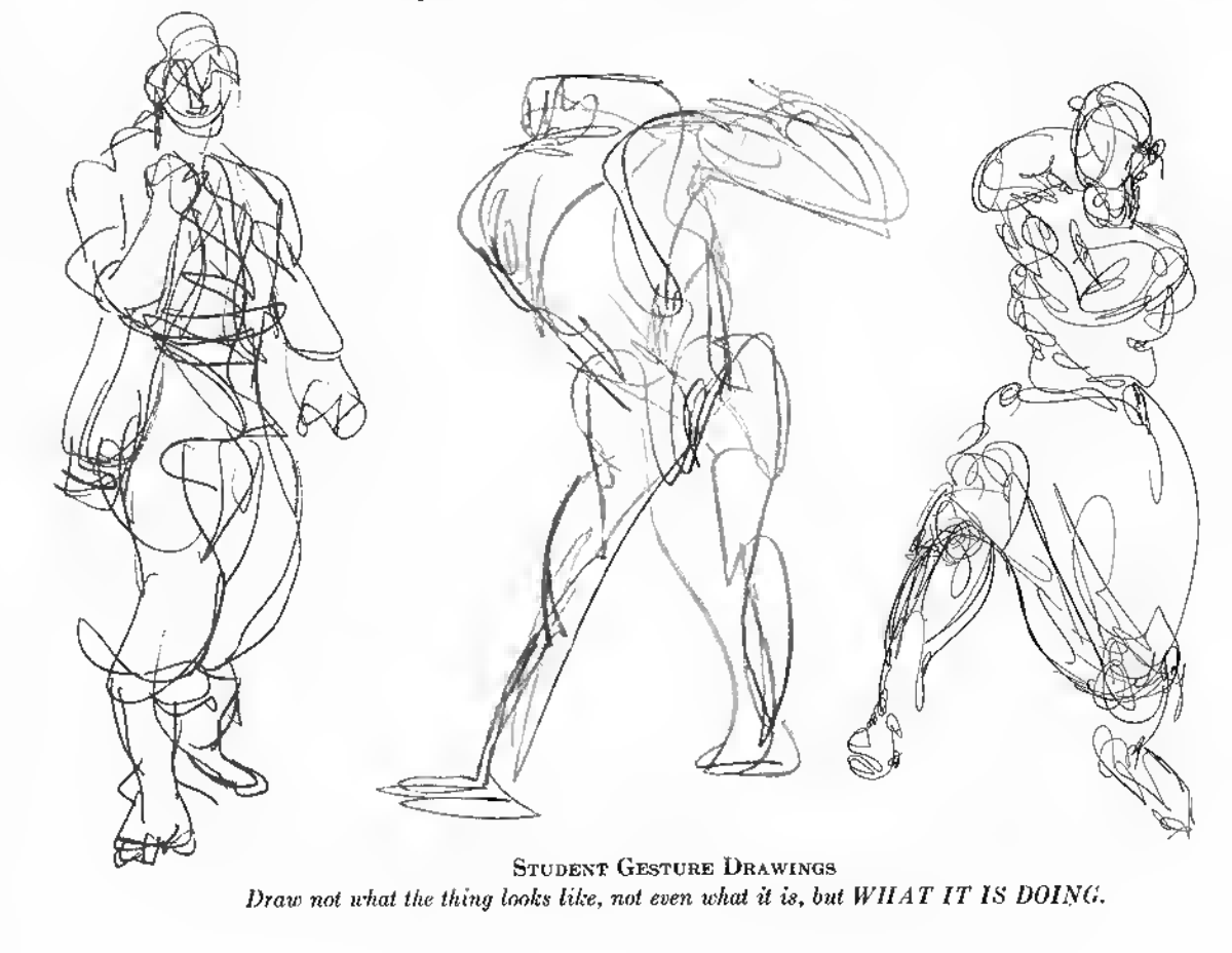
Student gesture drawings from The Natural Way to Draw by Kimon Nicolaides. Students draw gestures to warm up, to get the lay of the land.
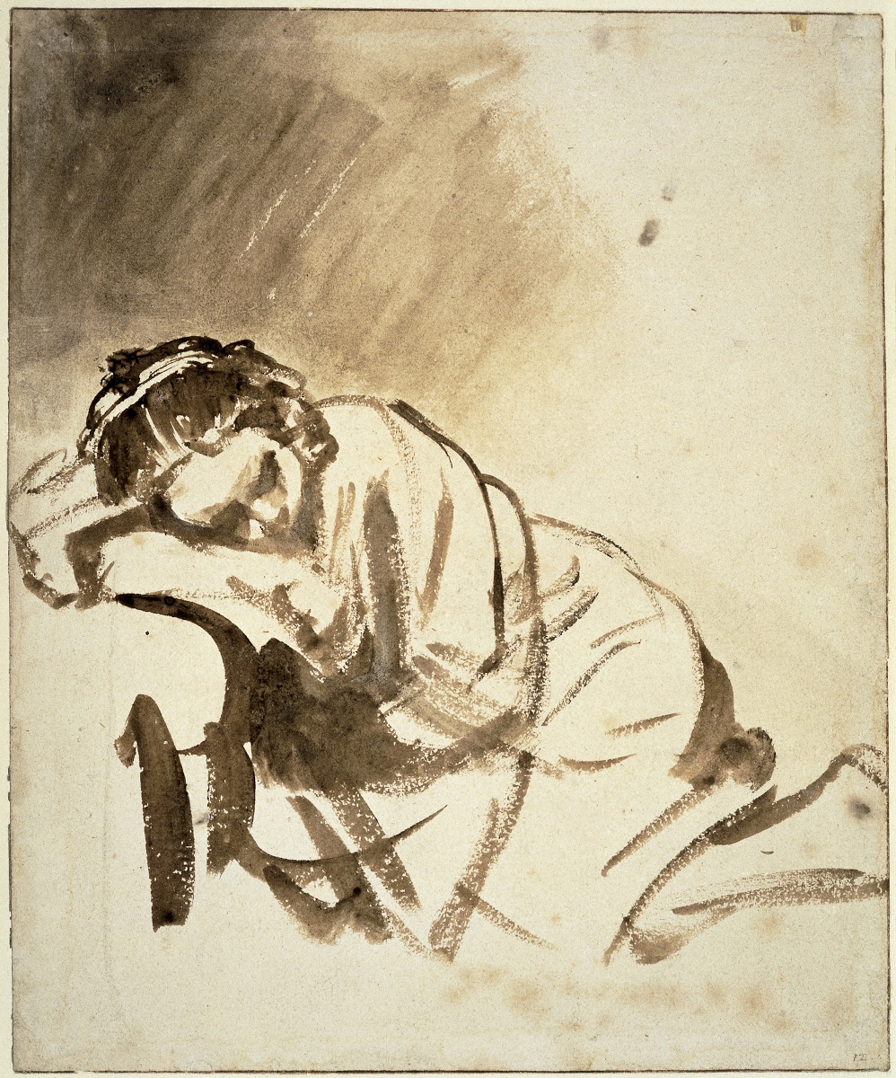
Rembrandt, Young Woman Sleeping, c. 1654. Brush and brown wash, no pencil underneath. One of the drawings we'd talk about in my drawing class. It has gestural elements but feels effortless because of expertise. Via Google Arts & Culture.
Parker Conrad had already built Zenefits × Conrad founded Zenefits in 2012 (YC W13), an HR/payroll platform that peaked at a $4.5B valuation before he was forced out. Six weeks later he started Rippling, covering the same territory but built properly. He says you don't learn much from failure explicitly, but the accumulated pattern recognition makes you faster. From a YC interview. before Rippling. Karri at Linear got to PMF in about a year. A whole team switched to Linear in its second month. By public launch, fourteen months in, they had over a thousand paying customers on almost zero marketing spend. But Karri had already been through a YC startup (Kippt) × Karri co-founded Kippt, a bookmarking tool, with Jori Lallo (later Linear co-founder) as a side project. It went through YC S12 and gained 10,000 users but never found a business model. Kippt was acquired by Coinbase in 2014. Karri's takeaway, from the same First Round Review interview: "We learned that it's really hard to turn a company into a business if you didn't set out to build one." , Coinbase, and Airbnb. At Airbnb he built a Chrome extension × Fun fact: I interned at Airbnb in 2018 on the design system team where Karri was the designer, and remember hearing about it after joining full time. This was also mentioned in his First Round Review interview, the extension got about 100 installs. to restyle Jira. Notion took longer. Ivan and Simon rebuilt from scratch in Kyoto before it clicked. They'd all earned the right to one shot, or at least to move faster. Nikita Bier × From a talk: "The most valuable thing you can have is a reliable way to test your app... that reliable petri dish to test in is the most valuable thing." talks about this. Your startup should be a petri dish, not a monument. Before TBH sold to Facebook, the team built 15 failed apps. But they got so good at building and testing that their first app took a year and their last took two weeks. The reproducible process was more valuable than any single idea.
I think the thesis should be a compass, not a destination. You have to hold it loosely enough to let the product diverge from the narrative. The thesis tells you where to look. The iterations tell you what's actually there. Proof of work isn't just shipping a lot. It's relentless truthseeking, shipping in a way where each version teaches you something that changes the next one. The reps happen while you're building something nobody wants yet, testing ideas that don't work, and learning to tell the difference between conviction and wishful thinking in real time. You can't get those reps any other way.
Right now I'm excited about AI. New things keep getting invented and discovered. ChatGPT, Cursor, Claude Code, OpenClaw. New capabilities that take what models can do and turn them into products people actually use. I still have many reps to go.
If you're building ambitious software, or any of this resonated, feel free to email me or DM me on X. Discussion on Hacker News.